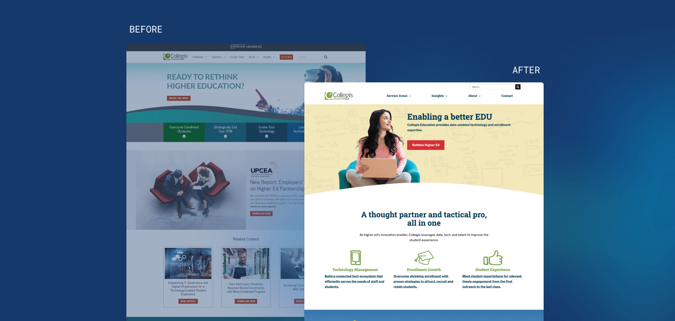
Collegis Rolls Out Refreshed Website Design

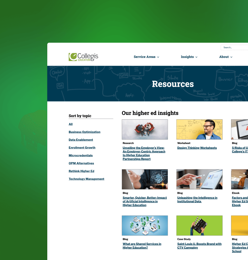
As higher ed’s innovation enabler, Collegis leverages data, technology, and talent to improve the student experience. Collegis was seeking a redesign with the objective of enhance the experience for their users. They wanted to make it less content heavy on in the navigation and across most pages to increase ease of use for anyone visiting the site. They also wanted the back end to be intuitive for their staff to make changes in the future.
The Opportunity
Working within a theme like Avada – a unique “drag-and-drop” system – vs. Creed’s own custom Blok Party definitely presented new opportunities for growth, and Creed was able to leverage the layouts and modules well to reflect Collegis’ needs. There was very little Creed had to build custom, but our development team was able to reverse-engineer how Avada made their custom elements so we could inject our custom spin on the theme.
Creed’s Solution
- Creed made recommendations on their designs for accessibility based on best practices, user interviews, and UX research.
- Creed assisted with content mapping to ensure a user-friendly navigation.
- Creed’s development team created custom Avada elements, layouts and templates to match the client’s designs.
- Ensured successful data and content migration.


“We had an ambitious plan to update our branding, reorganize our content by topic, and improve cross-linking of related content throughout the site for better engagement. Creed’s team helped us make that vision a reality, both on time and on budget, and we’re already seeing positive results two months later.”

